BRICS 2020 ★
It's a website for the 6th BRICS International Conference. The design turned out to be strict, minimalistic, and informative. Anyone can find the needful information, either visitor or potential partner or sponsor.
The site should bring the user up to date and tell about the state of competition policy and legislation discussion at a high level in the BRICS countries.
An intuitive interface should help users from different countries navigate the site.
Design
The client showed me examples of similar sites, which somehow attracted him with their structure and content placement, but not with their designs. All samples had one thing in common — a dark theme. I advisedly decided to move differently and took white as the primary color and cold dark and neon shades of green for accents.
The next question was how would be best to place various information: the events list, personal account, registration for participation, date, news feed with the main events, information for participants, living conditions, etc.
The first versions of main section:
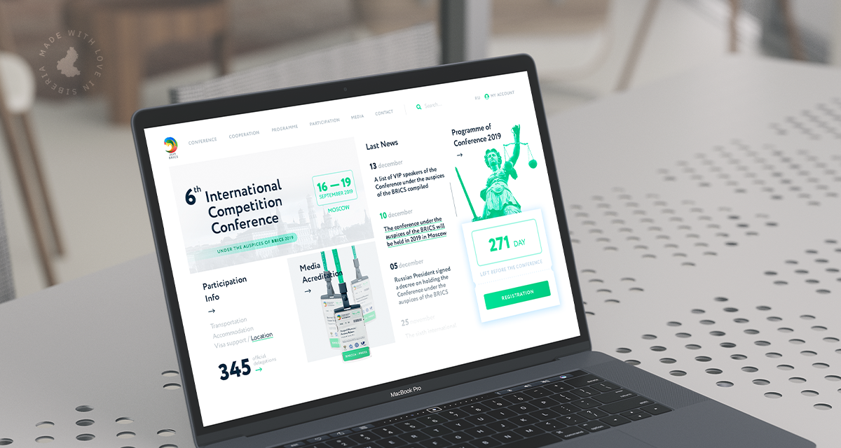
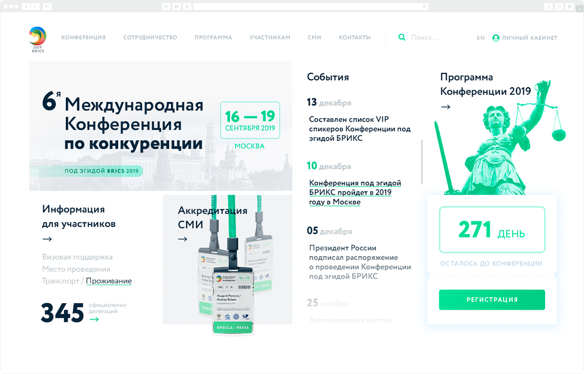
Then I decided to change my approach. Instead of freeing up space by placing additional items on the top panel and buttons, I put everything to the main section to fill it. Thus, all elements and essential information are visible at once, and there is no need to use the search and go to other pages.
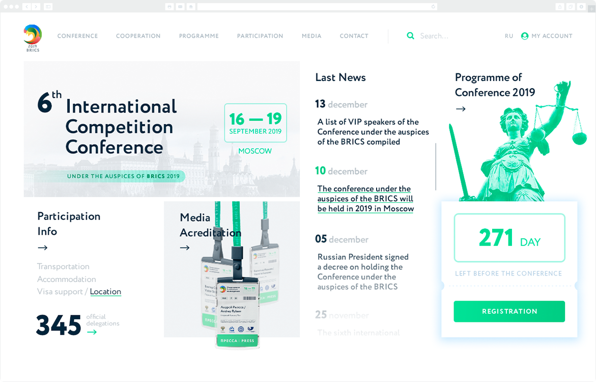
At first glance, there may be a feeling of chaos due to many clickable blocks. Still, when you're using it, it becomes clear that each element is in its place. All the necessary information is easily accessible for users who already know about the event and want to receive information.
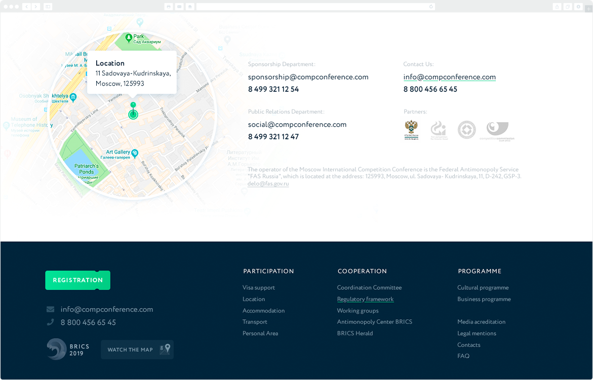
The Conference Info Section
This section contains detailed information for those who are going to attend the event for the first time. It tells the history of the International Conferences under the auspices of the BRICS.
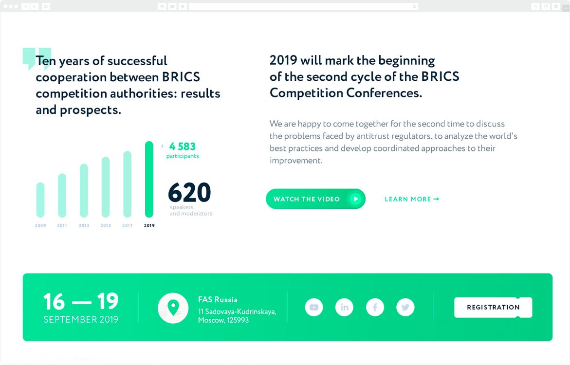
I also placed contact information that may need for any participant — from a press representative to a potential partner of the event.
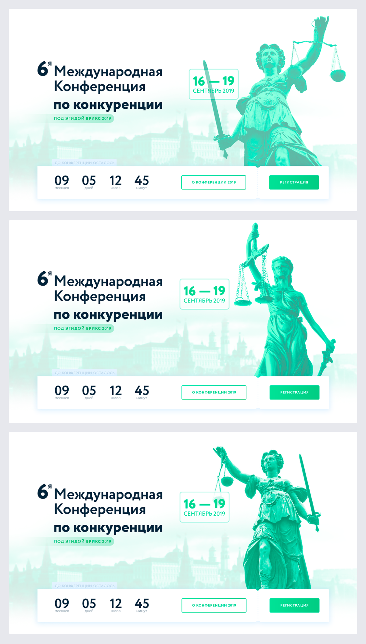
It was a version for foreign guests. But as the Conference was in Moscow, I made an alternative version in Russian, retaining the design and functional elements.
Thus, I have created an exciting design: user-friendly with an intuitive interface, clean and minimalistic, despite the vibrant display color.