Disolvatol ★
Design and development of a promo page for kidney health pills based on Phyllanthus Niruri extract. Minimalistic, uncluttered design that showcases the product at its best.
The client found me thanks to the projects of his competitors on the market. He provided me a text prototype with examples of what we would like to see in a future site. However, he completely trusted me. The most important thing for the client was to get the design at a high level. And my goal was to surprise a new client.
To begin with, I studied the product, its composition. It turned out that the plant, which is the basis of the product, looks really attractive, especially its fruits. So I started collecting a database of images that could become part of our design.
Design
For the color scheme, I chose a rather bold combination of bright emerald and neon lilac. Both colors are quite cold and, combined with a large amount of white space, create medicine and purity associations. That's what I wanted to show. They work on the product in the lab under sterile conditions. And in terms of its properties, it is a little closer to medical drugs than conventional food additives.
Focusing on the product, I added a simple animation that nevertheless looks impressive:
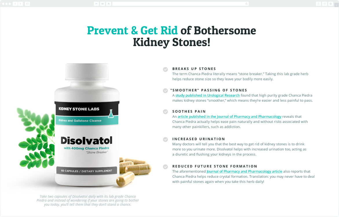
The next section, according to the prototype, was a comparison of our product with its counterparts. The usual for Russia "Unlike other drugs, our product is..." turned out to be a relevant decision in American marketing as well.
I've split this into two parts to emphasize the contrast further and placed the text about other products on a gray background with various faceless capsules and pills.
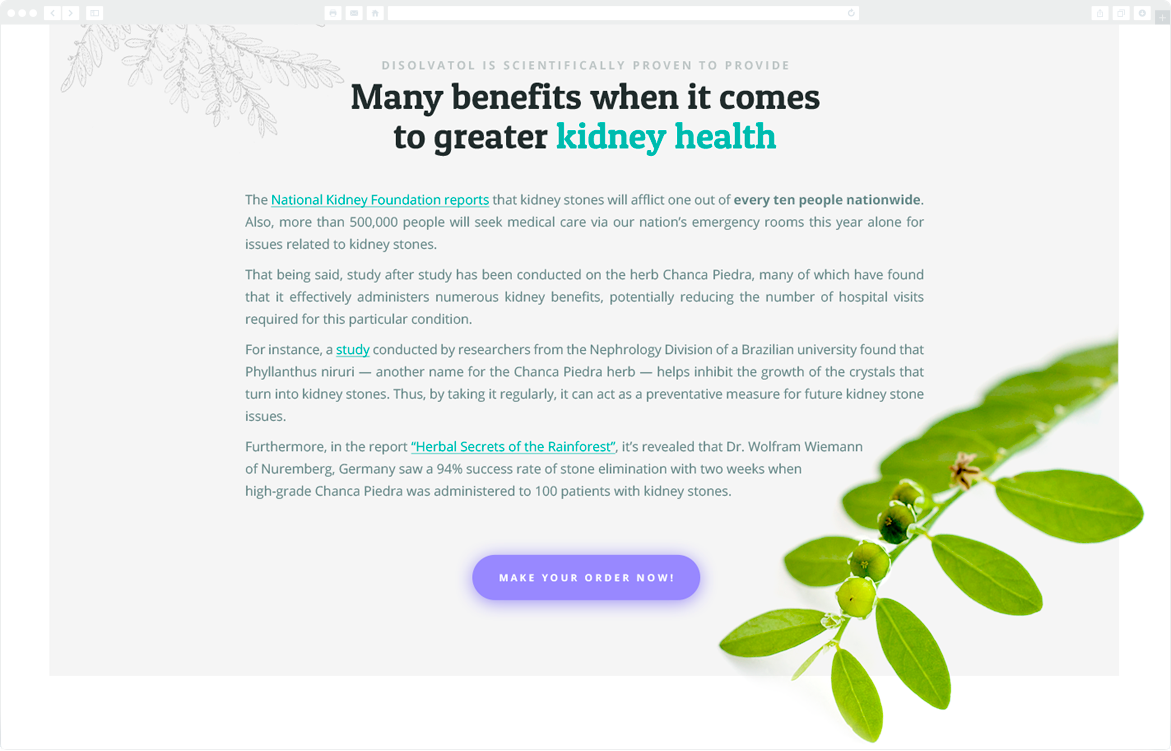
But Disolvatol information is on bright accent-colored background with a plant sketch, as in a botanical guide. This reinforces: the quality, composition, and effect of our product are much better than other food additives.
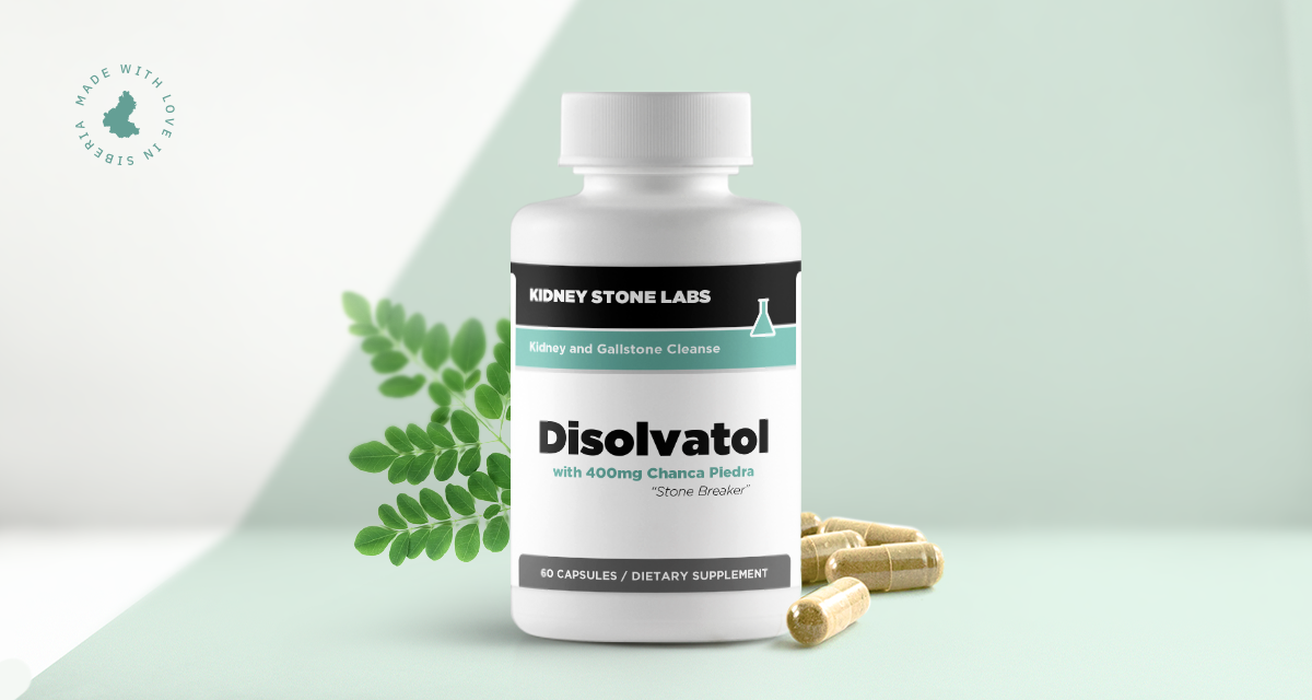
To present the benefits of the product action, I've compiled a scene. In a sense, such compositions have already become my "hallmark" in such projects. A few years ago, I got that this shows both the product and its supplement facts most favorably, especially if the package design is made with high quality, and I was right. This solution is still relevant among my foreign clients.
For the unity of all sections, I used Phyllanthus Niruri and its illustrations from the botanical reference book. Thus, I got exciting compositions.
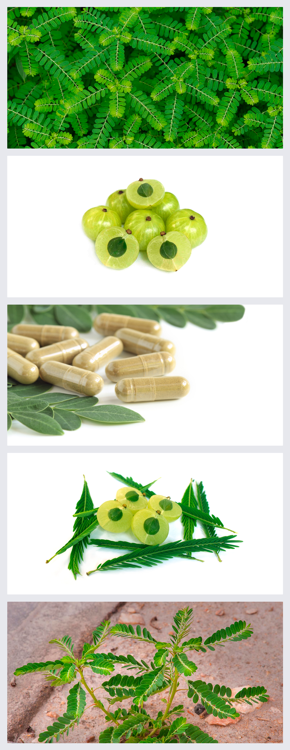
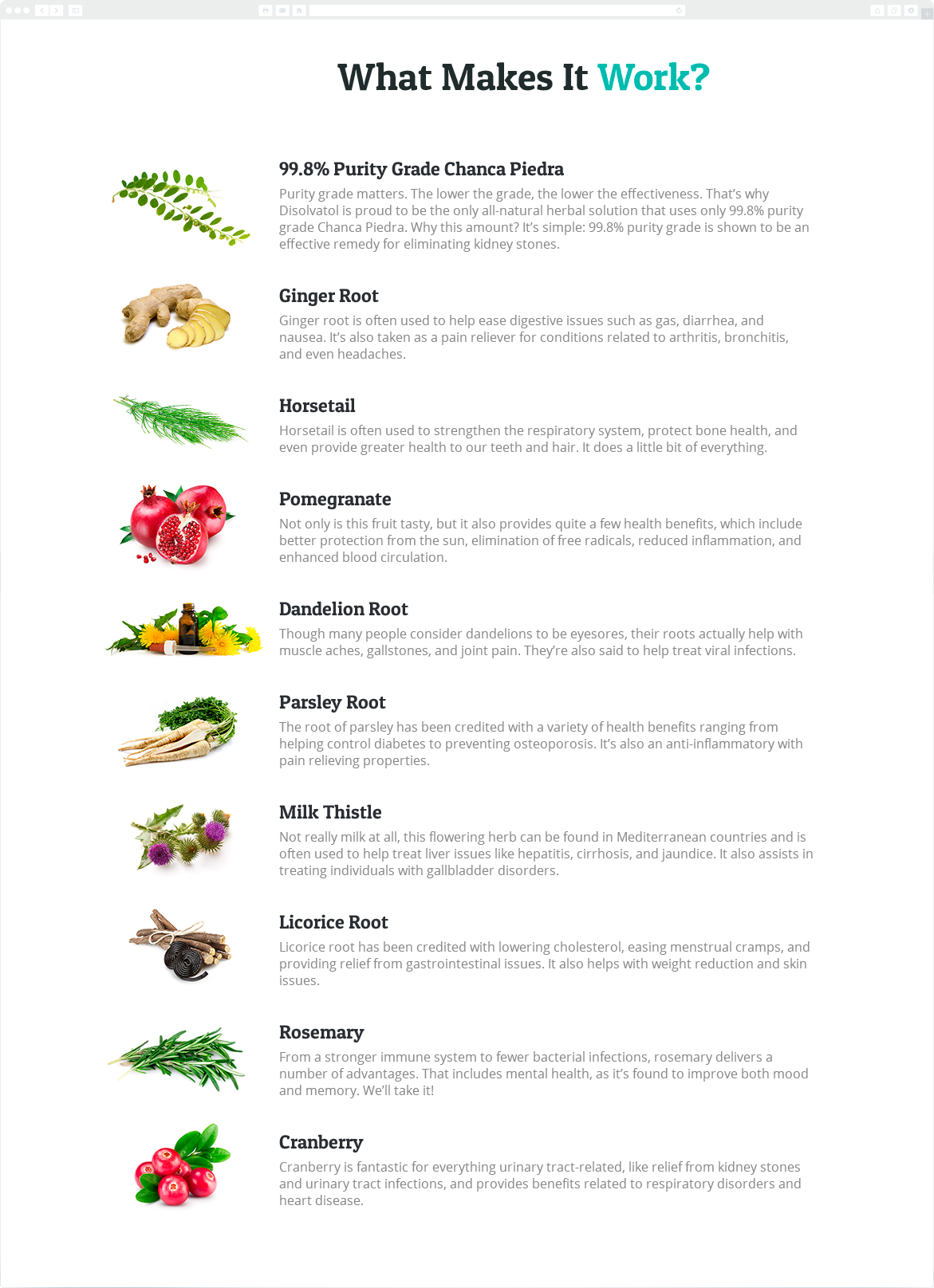
I showed all the product components in one list. In such cases, you usually see a regular list with markers, checkmarks, arrows, or other standard icons that have nothing to do with the text but simply break it down into paragraphs.
Instead of it, I decided to clearly show each ingredient. So I got rid of boring standard icons and gave customers a visual representation of each Disolvatol component.
The site of this project is still functioning successfully with this version of the design. This was my first project with a client who has become my regular client for several years.