Part 2\2. Tired of Amateurs? Handpicked Signs of Bad & Top-Tier Designers

Let's just move onward, yep?
Tracking (intersymbol distance)
Hey, are you playing with tracking? Oh, you! Naughty, naughty! Bad designer! Stop right now!
Generally, good guys can increase the space between the capital letters a bit when they need to get the accent caption.
Leading (line spacing)
General rule. The space between text lines is equal to:
the font size +10px.
If there's less space, the text turns into mush, which is quite difficult to read — a real challenge.
Proportions
No comment needs. Oh, it hurts so much... x(

Text block width
12-column blocks are hard to read. Believe me. I guarantee you'll feel the eye-strain on the 3rd line already, right at the moment when you lose the line. Oh, and you should at least keep in mind what you are reading. So what was that line?
The width of 6-8 columns for a text block is an optimal solution.
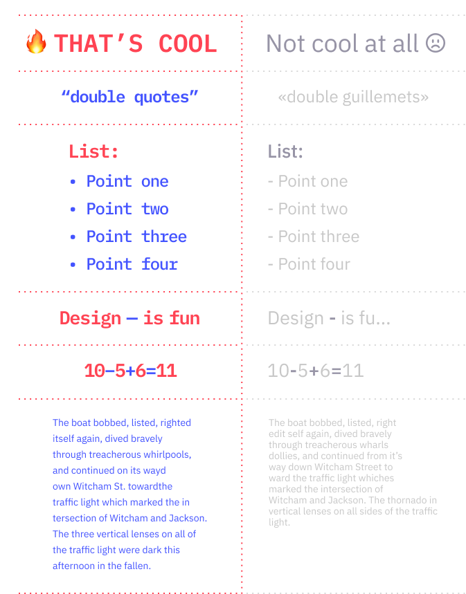
Symbols
Using incorrect typographic symbols or glyphs will ruin even the coolest designs in the world. So watch out for quotes, dashes, minuses, lists, and of course, dangling prepositions (web standard).
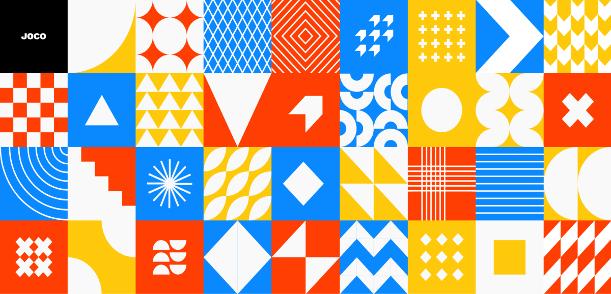
Color theory
It's simple: there are three basic principles for harmonious color combinations in design. At the heart of each is a color wheel.

A common rule: we don't use more than three colors in the design. Sounds boring? Well, good news. Black, white, and gray do not count — this is the base that can complement the palette.
Let's take a look at some literate combinations of colors and projects made by... Mad Hatter? I don't even know. Anyway, their masterpieces will help to feel what harmony is. And common sense (and, probably, the madness itself).
Disharmony Examples
(Runaway. I warned you)
Harmony Examples
Well. Hope you had fun at least. Now relax and look at this beauty:
Work with graphics
Nothing can kill your design as cruel as bad images. Vicious murderers. There are three ways to meet them:

Relevance
A designer needs to understand the project's purpose and the audience. The relevance of his creatives depends on this.
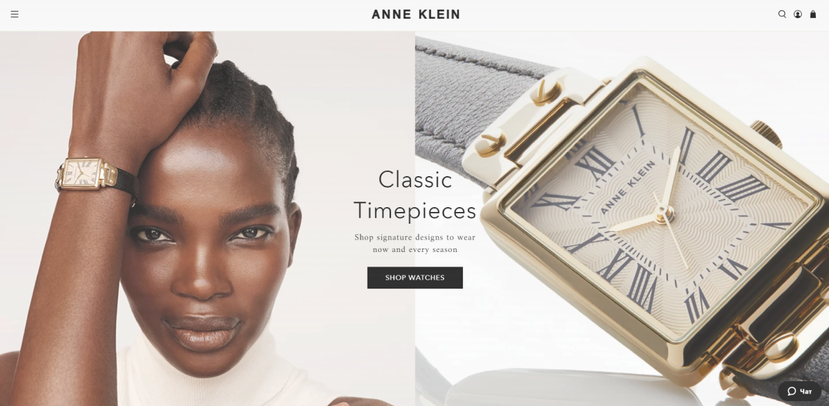
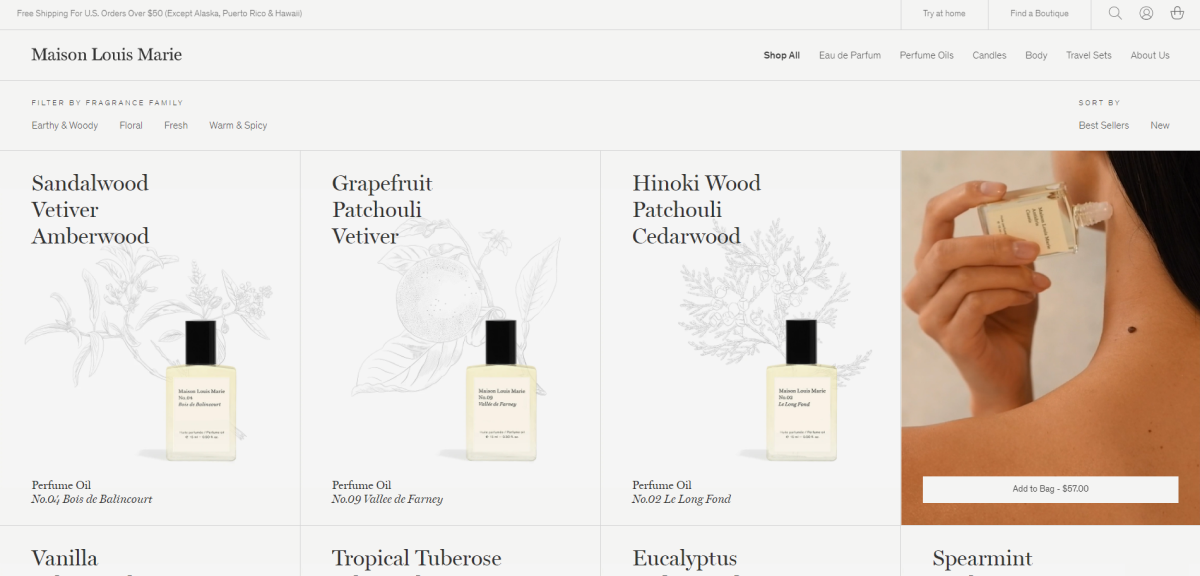
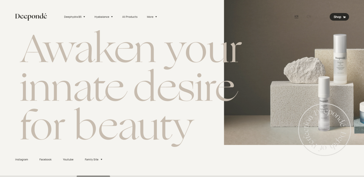
E-commerce
In e-commerce projects, the designer should reflect user behavior at the checkout. He should think out:
- Which path separates the user from the purchase
- In what sequence he will perform actions on the site
- What he will think and feel at the same time
- The overall impression of the project
That's what helps to meet the expectations of the target audience. Therefore, UX is the Master of Commerce.
The designer draws up the client's business for its customers. So, a good design can base on UX features that set the project apart from the rest:
The main page immediately gives an idea of the company, product, or service. The user can already decide if it suits him or not.
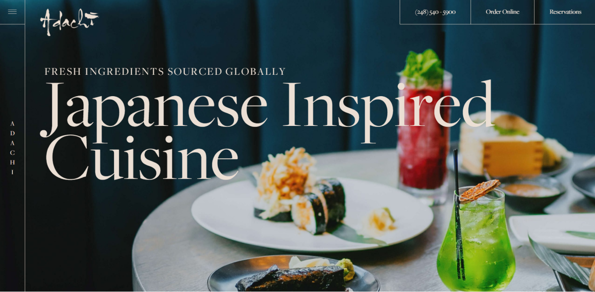
Real product photos, photos on the model, or at the time of use, work better than showcase photos.
Embedded videos help dispel doubts before buying

Nice-looking category pages with clear navigation and a cozy arrangement of products are also winning over.
Atypical product photos — too large, for example, give a wow effect
Horizontal scrolling of product photos instead of the usual slider can pleasantly surprise the buyer
Websites are created not for beauty but business; to have business success, we need to get clients. That's why the pages always have a Call To Action: booking, order, feedback, subscription, sharing buttons, etc.
It can be anything you want, even a download of your last catalog. The goal is to interest the client, attract attention. The appearance and design play a vital role in the "to click, or not to click" user's decision.
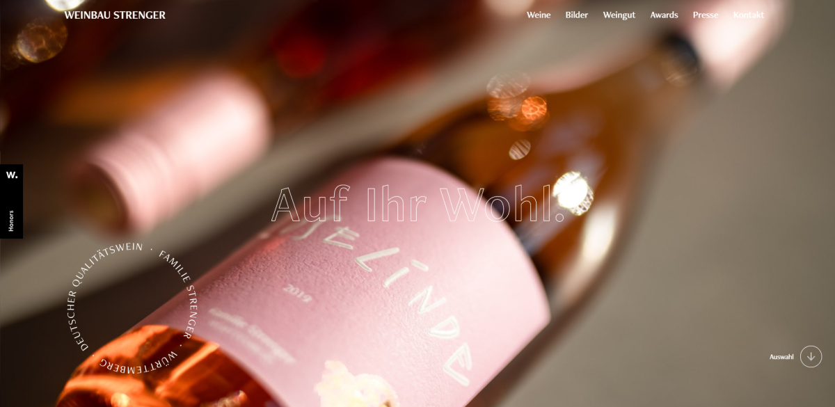
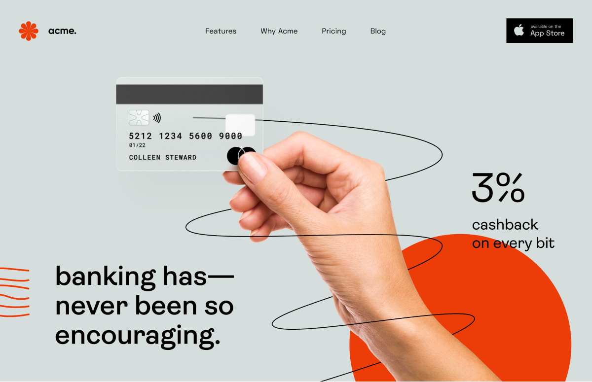
Promo sites
Promo has completely different rules. Its purpose: to hook the user, to show the product from an unusual side. So, In this case, the design is more critical than UX.
UX techniques in promotional sites differ from traditional ones. They focus on:
- interests,
- weakness,
- fears,
- hype or trends.
In this case, the site even does not have to be "expensive." The main goal is to highlight the distinctive brand's features.
Where to find references
If you are a customer, you can look for examples of how you want to see your future project on the resources below. Project managers or aspiring designers can use them to prepare for a brainstorm.
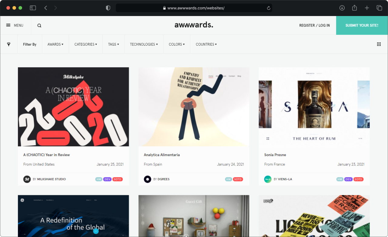
Awwwards
There is a search with sorting. Another feature — animated previews, which let to see the best solutions for sites without entering each project separately :)
Dribbble
It is arranged according to the social network principle, so you have to create a personal account. The search system is similar to Pinterest (read below) - you can also collect your favorite projects.
The downside is that the authors hide some projects from unauthorized persons, and you can see them only if the project author adds you to the list of allowed users.

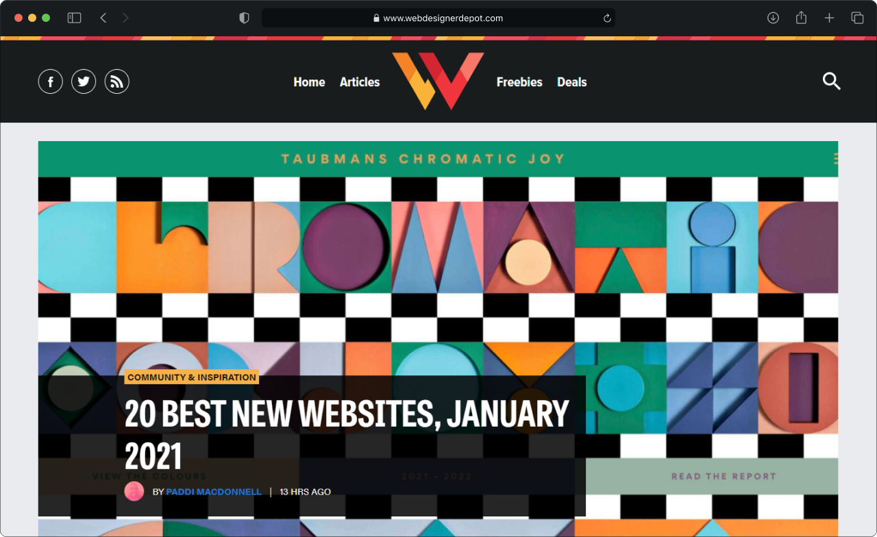
Webdesignerdepot
It collects all events from all sites. Convenient when you need to look at the top trends quickly or read the latest design articles.
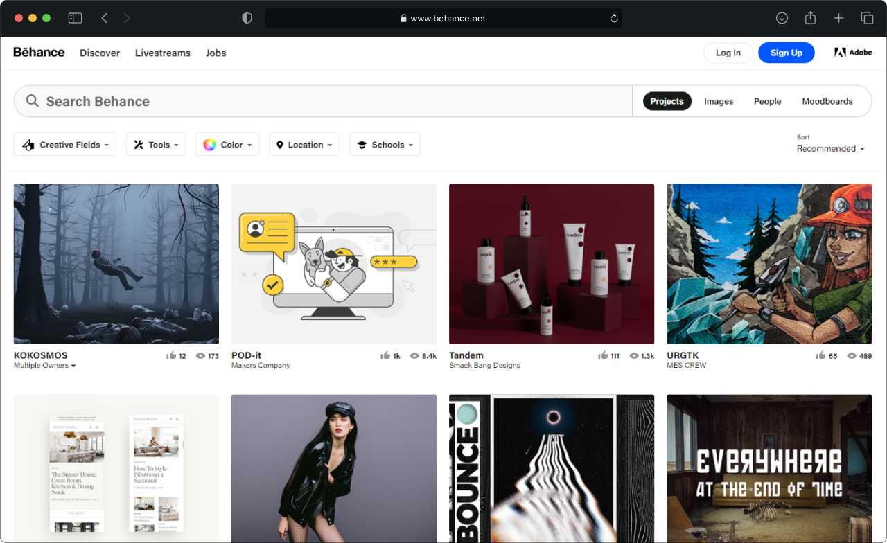
Behance
It's also useful to create an account. You can search for projects or mood boards; there are categories of all design directions. You can also take projects to your boards and make selections.
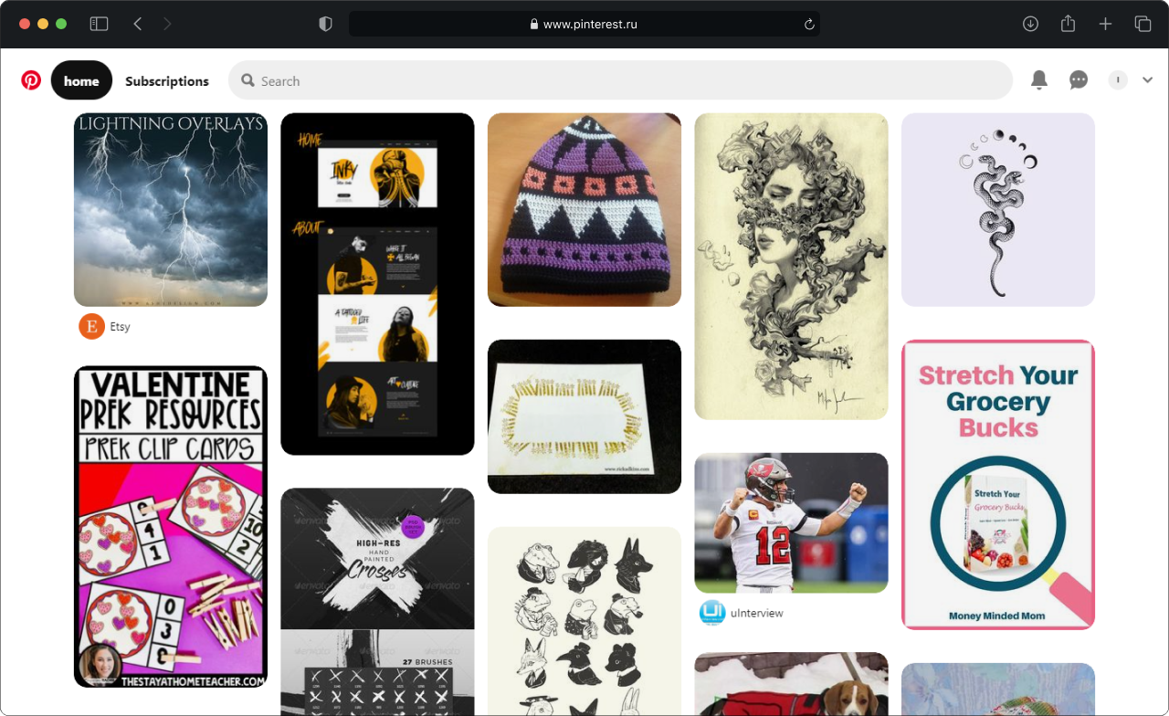
You also need an account. And you can also search by category. Convenient in that the preview contains links to real projects, which can be copied and saved.
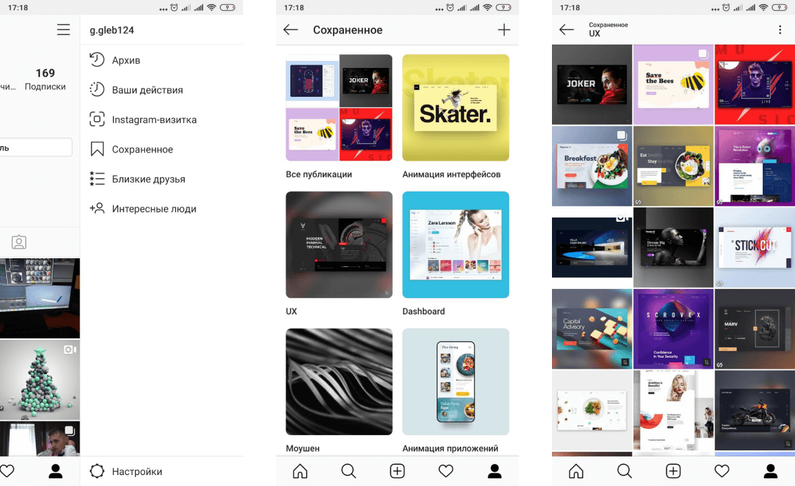
Yep, it's not just for selfies. There are also a lot of design projects. You can search by tags and save your favorites as bookmarks and group them.
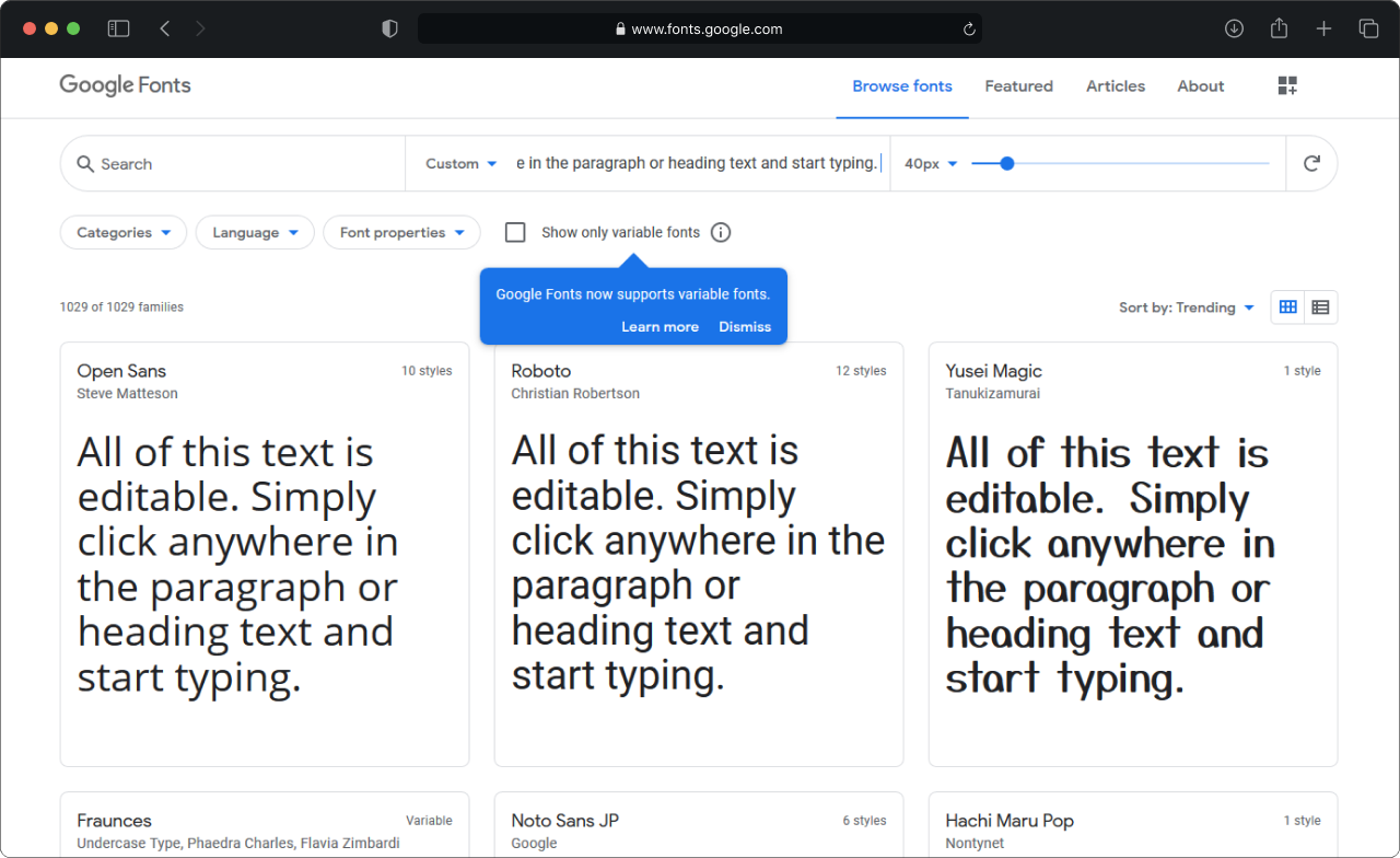
GoogleFonts
It's a collection of free fonts for all occasions. There is also search and filtering. Well, if you are in doubt about choosing a font pair, take a look at FontPair.
Have you read to the end? Hurray, now you can tell the designer that his work is poo-poo, instead of the lengthy "well ... I'm not sure, but it seems that something is wrong." You will be able to manage the design at the stage of creation.
You won't stress in the evening before the deadline when it turns out that in reality, everything is not right. Good luck and hire only good boys.
Thanks!