Vitaforce ★
American manufacturer of food additives. The main advantage of the brand is a product that is 100% natural. And most of the ingredients are grown on their own farm.
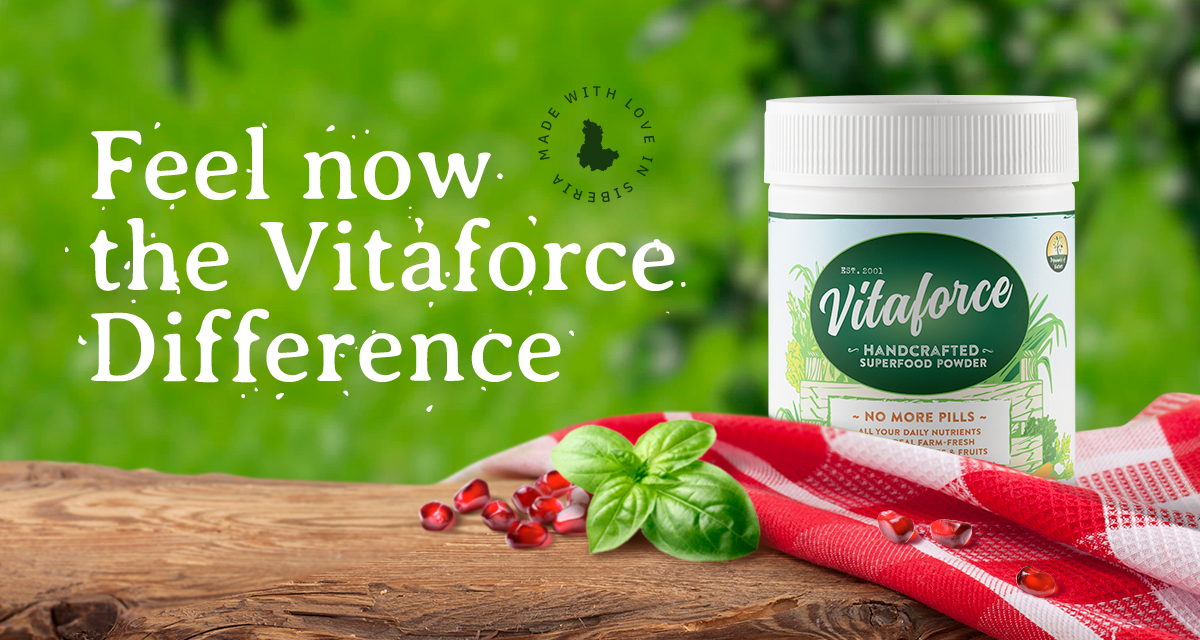
Dynamics of Nature produces a citrus-flavored vitamin cocktail providing all needful components for our health. Due to its unique properties, you know below, Vitaforce replaces its analogs in pills. So, my main task was to convey to customers the 100% naturalness of the product, its connection with the farm, fresh vegetables, and fruits.
The client confidently said he wants to see the rustic motives in design, so I immediately started to work with the mood board.

Design
After studying the client's project materials and looking through hundreds of images and references on a given topic, I literally felt this aesthetic with my skin. And right away, I understood - there is a fine line here. It is too simple to fall from a cozy, slightly shabby look into cluttered junk and rubbish, overloaded with various elements.
But I should start somewhere, so I decided to give it a try. The first version was based only on the client's wishes, so I could understand where to go next.

When I made several versions, it became clear what was missing to get a unique, unusual solution.
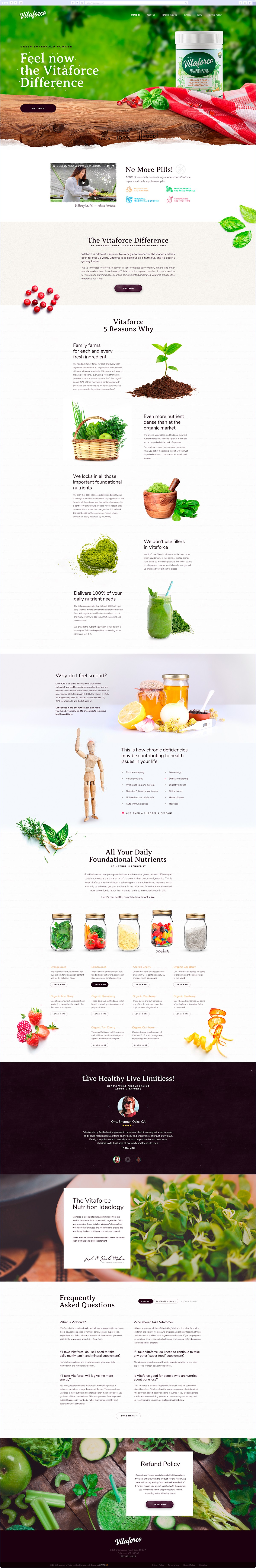
I placed the product among its main ingredients. This composition I put on the table — roughly processed wood with a classic American-style tablecloth. That creates the atmosphere of a small home farm. And a looping video in the background to bring the composition to life.
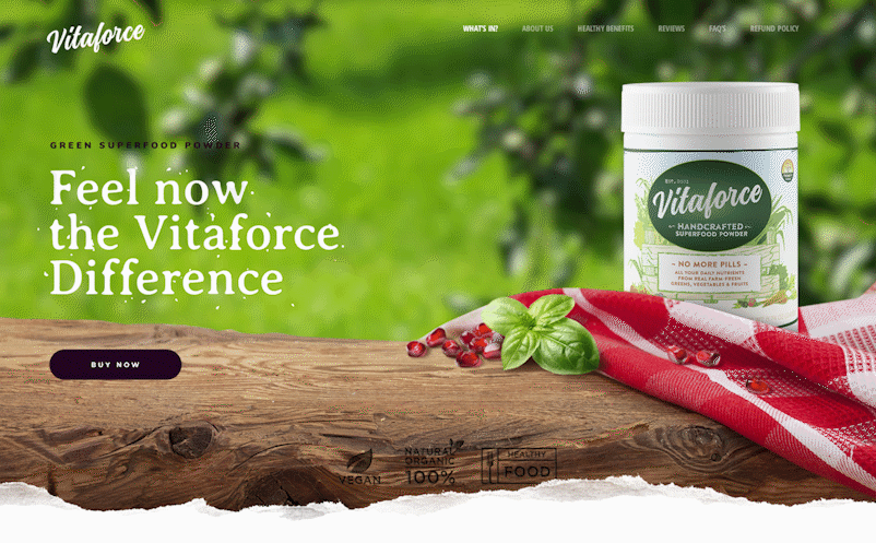
The main idea is to use only Rustic elements, not wholly following this style. That way, it became possible to convey the purity of the product, arouse the desire to try it, and maintain minimalism in design.
Checkout page
Usually, these pages have several steps. It is important to get all the information you need without scaring the client away. Filling out the endless forms can be tiring, and the customer just won't make a purchase.
Here I decided to arrange the form steps as slides on one page and show the filling progress. This way, you can see at a glance how many forms you need to fill out, which guarantees more completed orders.
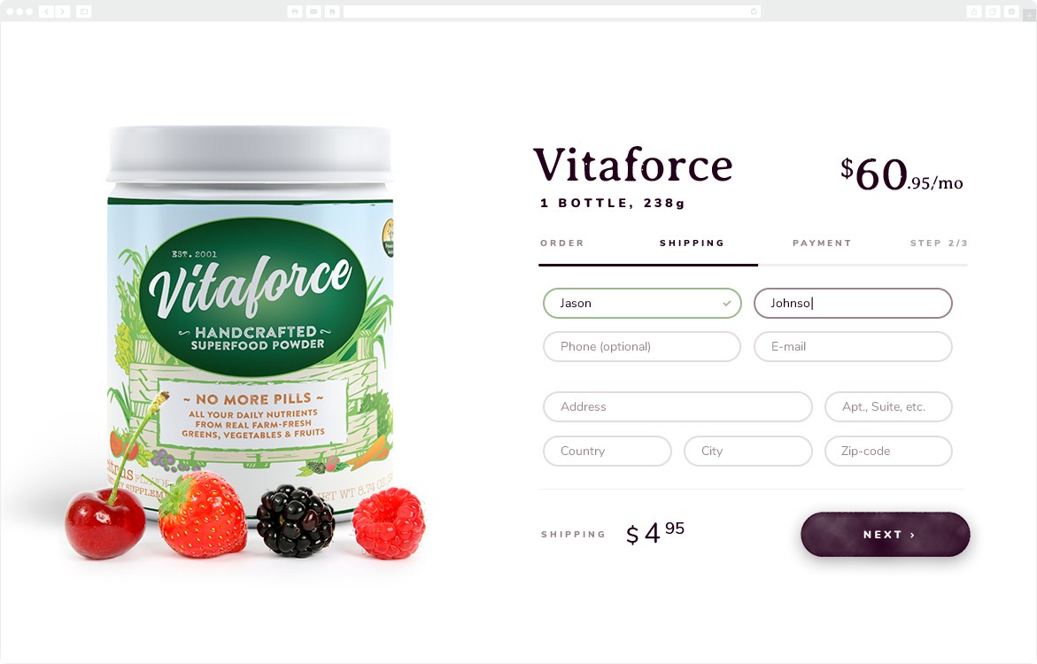
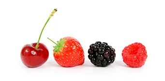
Exciting details that we added to the page: berries, fresh leaves, and even illustration elements. The items evoke sympathy and indicate that the product is really created with love and great attention.
Another original solution is the section with the composition of the product. The Vitaforce lineup is complicated. There are many ingredients, and not all of them I could visualize. For easy perception, I divided the constituent elements into main groups:
- Super Greens,
- Vegetables,
- Superfruits,
- Several types of Non-active Nutrition Yeast,
- Dairy-free Probiotic Blend.
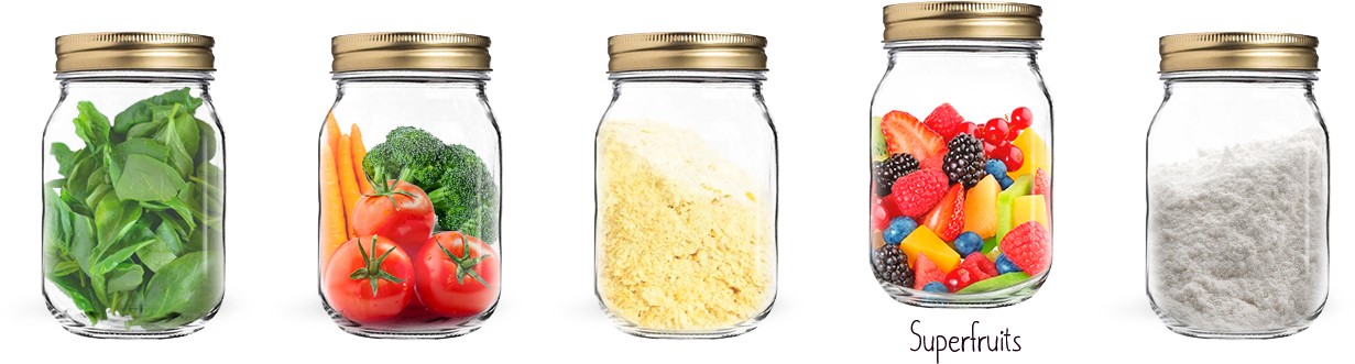
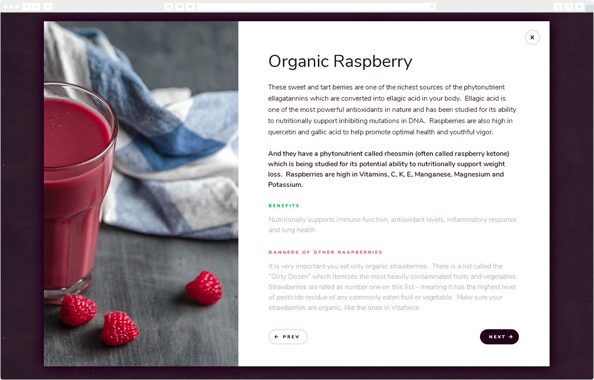
I organized and framed the information about each ingredient so that any potential buyer can easily understand what properties the product has, even if he does not read the text completely.
I highlighted the main benefits and the main properties.
I had great pleasure working on this project.