8 Simple Steps to Get Right Designs
How the design process looks?
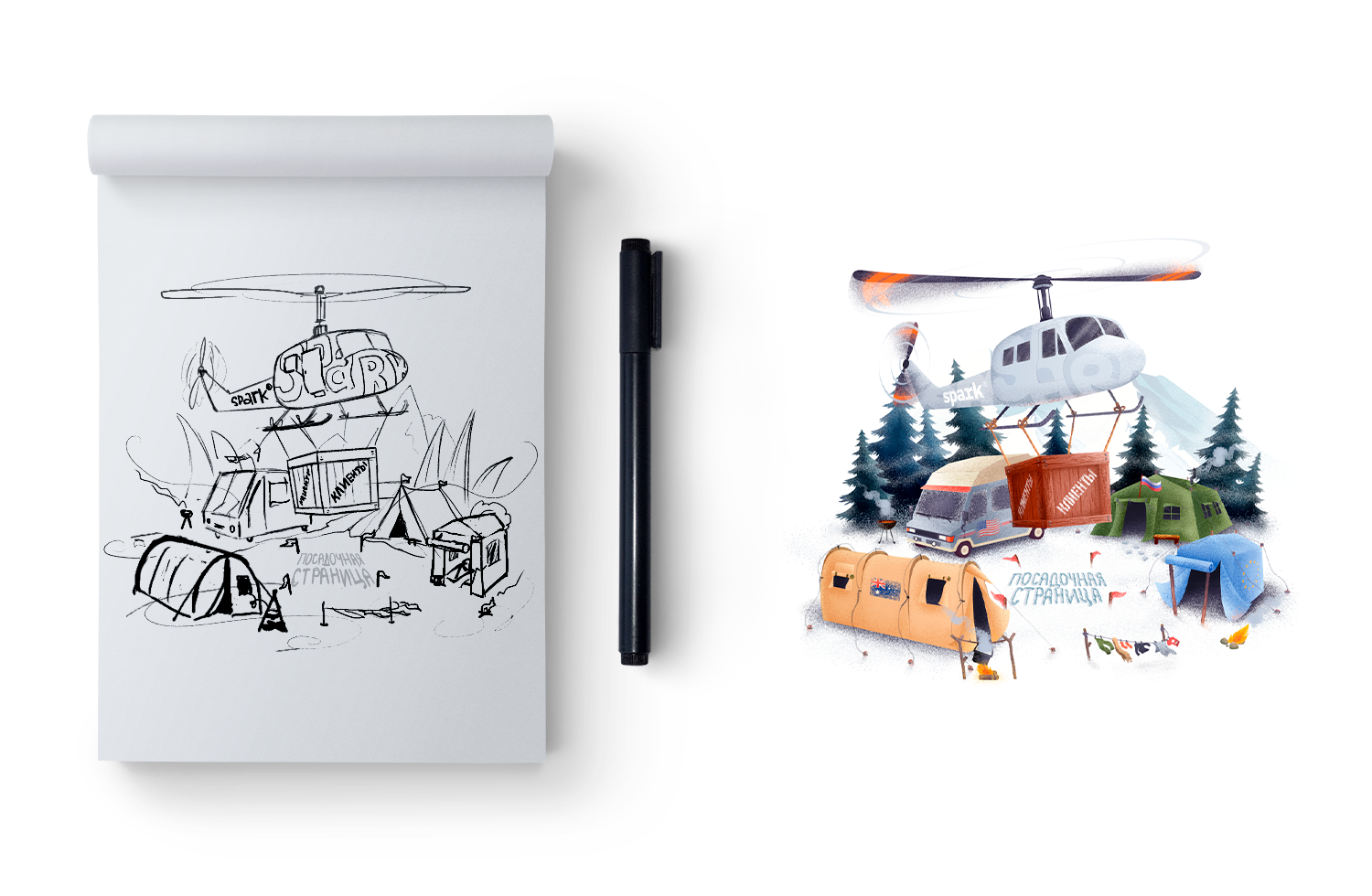
The Revelation Article
Imagine: It’s dark. Only narrow strips of sunlight find fault through the closed roller blinds, lying on the desk. The rustle of music in the headphones is barely audible. Periodically silence is disturbed by active mouse clicks and periodic tapping on the keyboard keys. Quiet, the exam is in progress! The designer creates masterpieces.
In the design department, such a mysterious and slightly private ambiance — every day. And if you know absolutely nothing about the process of creating design layouts, then it seems as if creations are born by mouse roll or by one power of the master’s influence. Yes and no at the same time. Let’s take a look at the sanctum and figure out what makes a cool design that wins awards.
First Stage — Requirements Aggregation
Theater starts with a coat rack, and design begins with an aggregation of requirements. There are many facts in the accumulation, research of people, competitors, and the market. And not an ounce of creativity. Such analytics is needed to understand whom we are creating the site for, what needs and problems these people have, and what sections of the website they need. This stage is a large document in mindmap format, which becomes the designer's handbook at project production.
- Analysis of target persons with their pains, interests, and what we had to offer;
- A vision of the project, goals, and objectives of the client;
- Analysis of chips and jambs from competitors;
- Website structure.
Second Stage — Creativity-Degree Switcher
There is a difference between creativity and creativity, and you should always remember what the type of project it is and what it's the audience is. A degree of creativity in e-commerce can be various from corporate and promo websites. So, if you don't sell some downright stubborn things like lamps in the form of a woman's breast, be careful with your desires — in the hands of a creative designer, your wishes will quickly come true. I even have a separate article about good & bad design. Please check it and better don't do it like this.
There is an unspoken creative switcher to determine the degree of design-courage for each project. If not to complicate, then it looks like this
- 05% — Traditionalism & Conservatism;
- 50% — Strongly. Boldly. With a slight touch of weirdness;
- 99% — Madness Itself.
Usually, I determined it together with the client. But there are several participating factors, like
Type of The Project
If it is e-commerce, then the designer's task is to repeat user behavior at the checkout. It is crucial to think through what steps separate users from the purchase, how they will move towards the cart and checkout, and help them do it quickly, clearly, and carefully. In such projects, 80% of success is UX, and only 20% is due to design. Although, sometimes, one doesn't conflict with the other.
For promo-sites, things can be different. The task here is to hook users and force them to achieve the target action. All design tools are useful here, although UX should not be forgotten entirely.
Clients Requirements & Suggestions
I've met exacting clients against any creativity: everything should be clear, simple, and to the point. It makes sense if you run a large corporation, for example. But at the same time, among the leaders of cool companies, some were not against design experiments.
Target Audience
It can be offered non-standard sliders and animations to experienced users, but you need to be careful if there is an older generation among the target audience. And provide a version for the visually impaired, for example.
Industry Principles
Rules were created to be broken, but you have to know how to break them. Yes, I have to work on narrow niches projects, where it is usual to do this and only this way. But this didn't prevent me from highlight the client from other experienced competitors — a cool idea and its implementation, which, at the same time, didn't argue too much with the industry standards.
So, when we have found out all the traps and talked with the client about the degree of creativity that is adequate for him, we can start looking for ideas.
Third Stage — Searching for Insights
Insight is a hidden truth. What made "Head & Shoulders" the #1 anti-dandruff shampoo. What makes you want a bottle of cola to the song "The Holiday Comes to Us." What makes "Calgon" sticks the best washing product.
Useful insights do not lie on the road. And they don't even lie on the surface. You have to dig deeper — look for some distinctive feature of the client that will set him apart from the rest and be his main difference. Moreover, it will highlight positively.
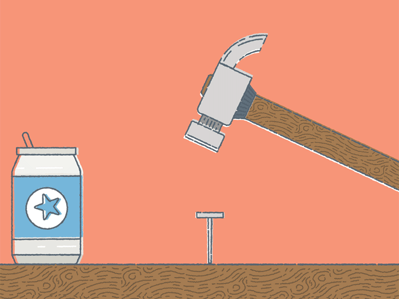
Often, insights are hidden in the sacred lines of logos, in naming, in corporate identities. Sometimes, everything isn't so simple as you wanted, and you have to get a shovel to get to the bottom of the truth. For example, for the wholesale online store of building materials, "Vertical Tools," which focused on those who use the Internet for themselves, insight is simplicity. Using it is as easy as hammering in a nail
Stage Four — Brainstorm
A pair of years ago, there was a prototype at this stage. We solved the form's problem, and only then we thought about the design content: stylish, fun, trendy, and with tricks. But if the project required a high level of creativity, the prototypes turned into something covered with gray blocks with the words here will be creative and looked at least strange for the client. As a maximum, they provoked to anger, "Why the hell did I pay money for this?".
Therefore, we decided that for projects with 20-50% creativity, there will be a process of its own: prototype → references → brainstorm → design. It's different for those who need more creativity: references → brainstorm → sketch and mood-board (visual brief) → prototype → design.
But someday, it became clear that there is a conflict when the prototype walks in front of a brainstorm. On the one hand, a designer shouldn't only design but also rely on analytics. And it's easier for him to work if he already has a prototype. On the other hand, a prototype without goods from a designer is not as cool as with them.
The way out is a brainstorm before the prototype for all projects. The designer, an analyst, a project manager, and even a creative director attended a prototype. The benefit is that the designer and the analyst work together — they generate ideas and create a project framework. The analyst prepares a general large prototype, and the designer prepares promo sections where the project idea can be shown in a graphic.
Before brainstorm, the designer prepares. He throws ideas and suggestions, scratches something, and draw on paper pieces. The brainstorm itself consists of two stages:
- Generation and combination of all possible ideas;
- Selection of valuable concepts.
The basic rule is not to criticize them at the stage of collecting ideas. Someone suggested on the manufacturer of cartridges a spaceship on the main — let it be. An idea came up for a natural cosmetics brand to layout products like sushi on a naked woman; hmm... Well. The more ideas there are, the easier it is to choose viable ones in the next stage. And some of them may later be mixed or enhanced with others, especially if they require a sketch before the prototype.
The ideal result of brainstorming is a ready-made feature of the project and animations' idea — which elements and how they should perform. In the case of a very creative project, the result may be another sketch, a pencil drawing of the idea.
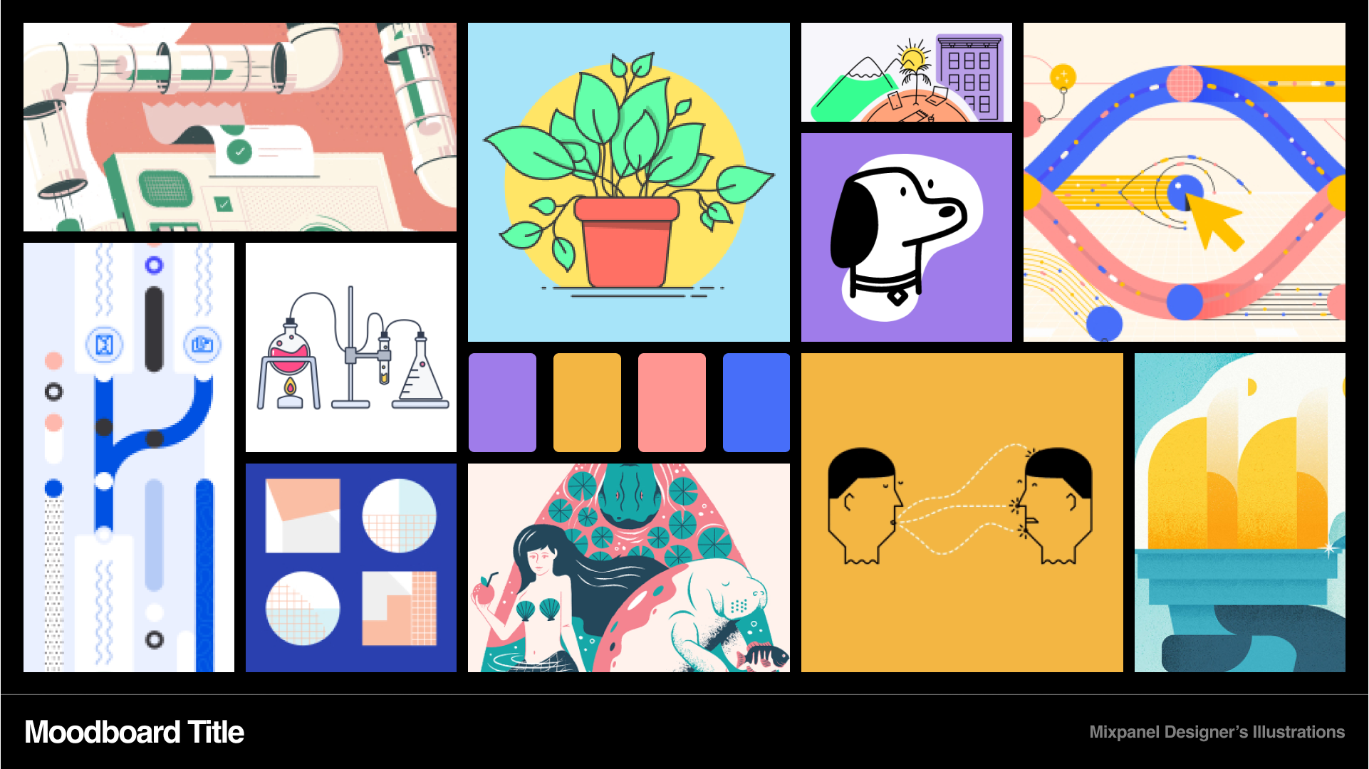
Stage Five — Mood-board
in other words visual brief
A selection of examples of ready-made sites and elements in different graphic styles. There will be reference websites from the client and the aggregation of requirements, trends, exciting options from related industries, and completely different areas with cool tips and ideas. There will also be other types of icons, fonts for interface elements, and forms. Sometimes — examples of graphic content.
At one time, we also made a mood-board after the prototype. But it turned out that if they were reversed, there would be a continuous benefit for everyone — for the client, designer, and the manager who rushes between two fires.
The Practical Value of Mood-board
That's how a designer could understand what the customer wants to see due to using real examples. Clients are often far from the web-dev, and it is easier for them to stick with the standards they want. On the mood-board, we see how the client sees the structure and design in his head. After demonstrating the mood-board, there is already an understanding of the future project; the client will or will not start. The prototype is also drawn with an idea for a specific design structure already.
Another plus of this method is some perks for situations when different designers are involved in a project. Even if I draw the prototype, and someone else will draw the homepage design, he will already have an agreed base of wishes for visuals and structure. So everything was thought out before, and he doesn't have to search for solutions again.
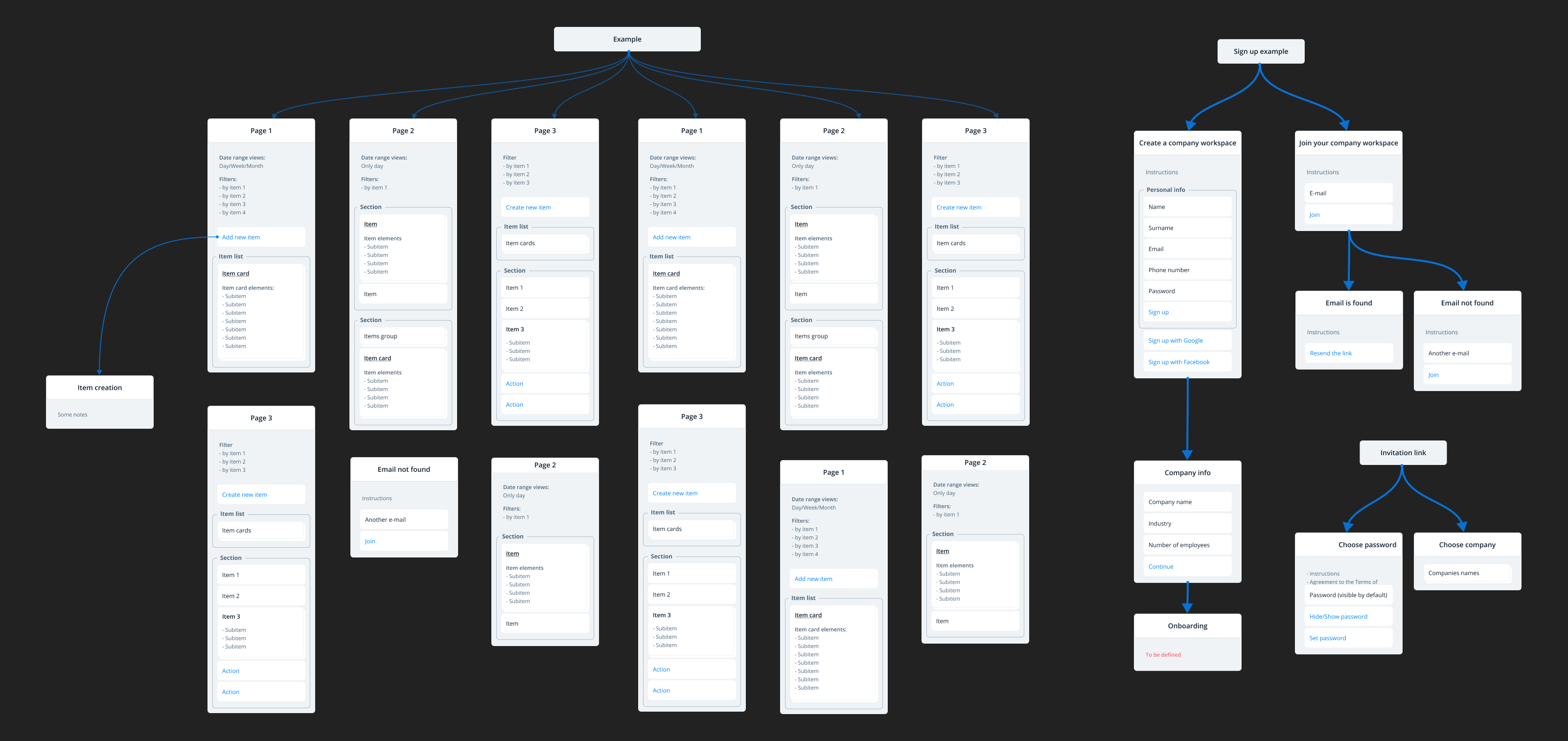
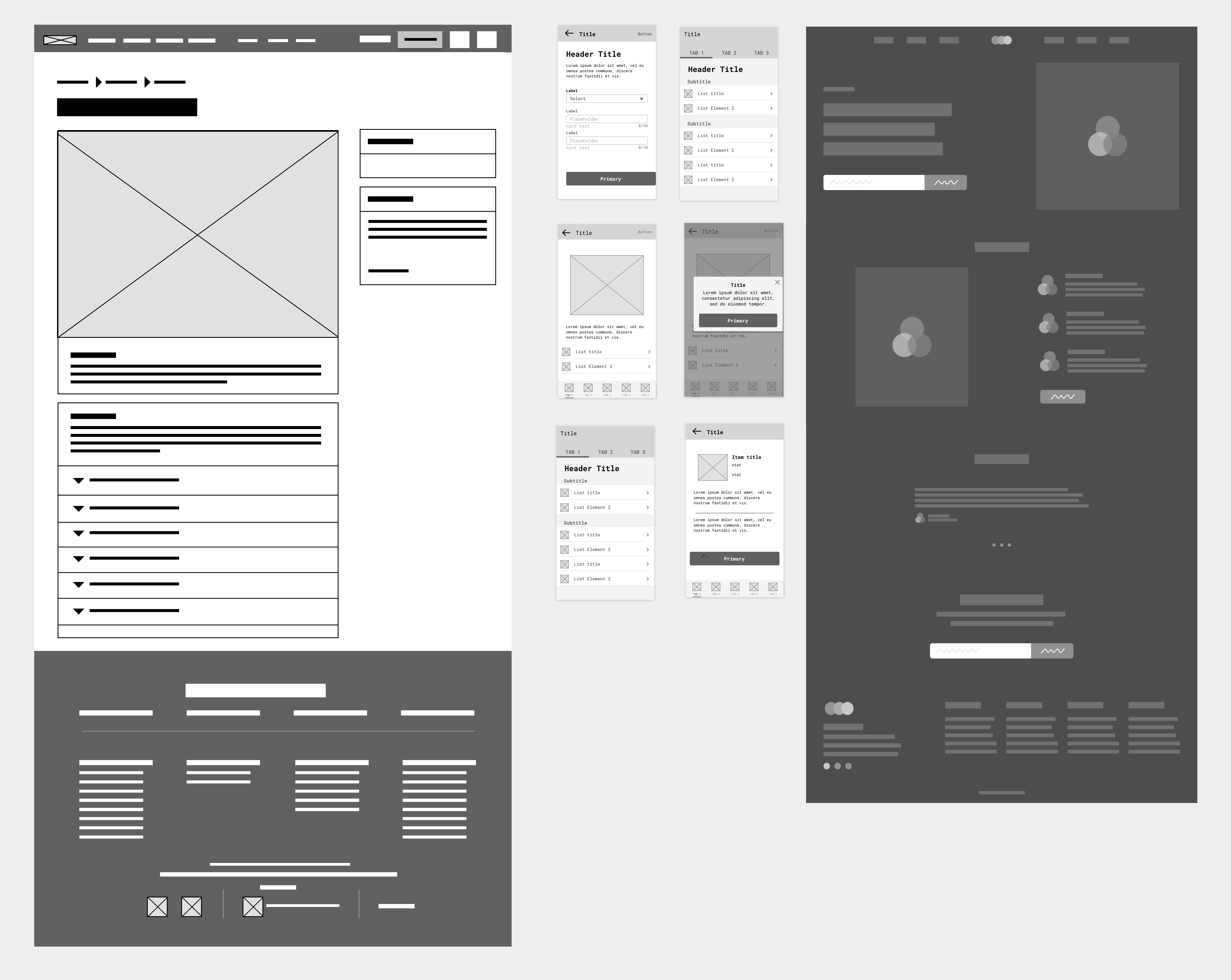
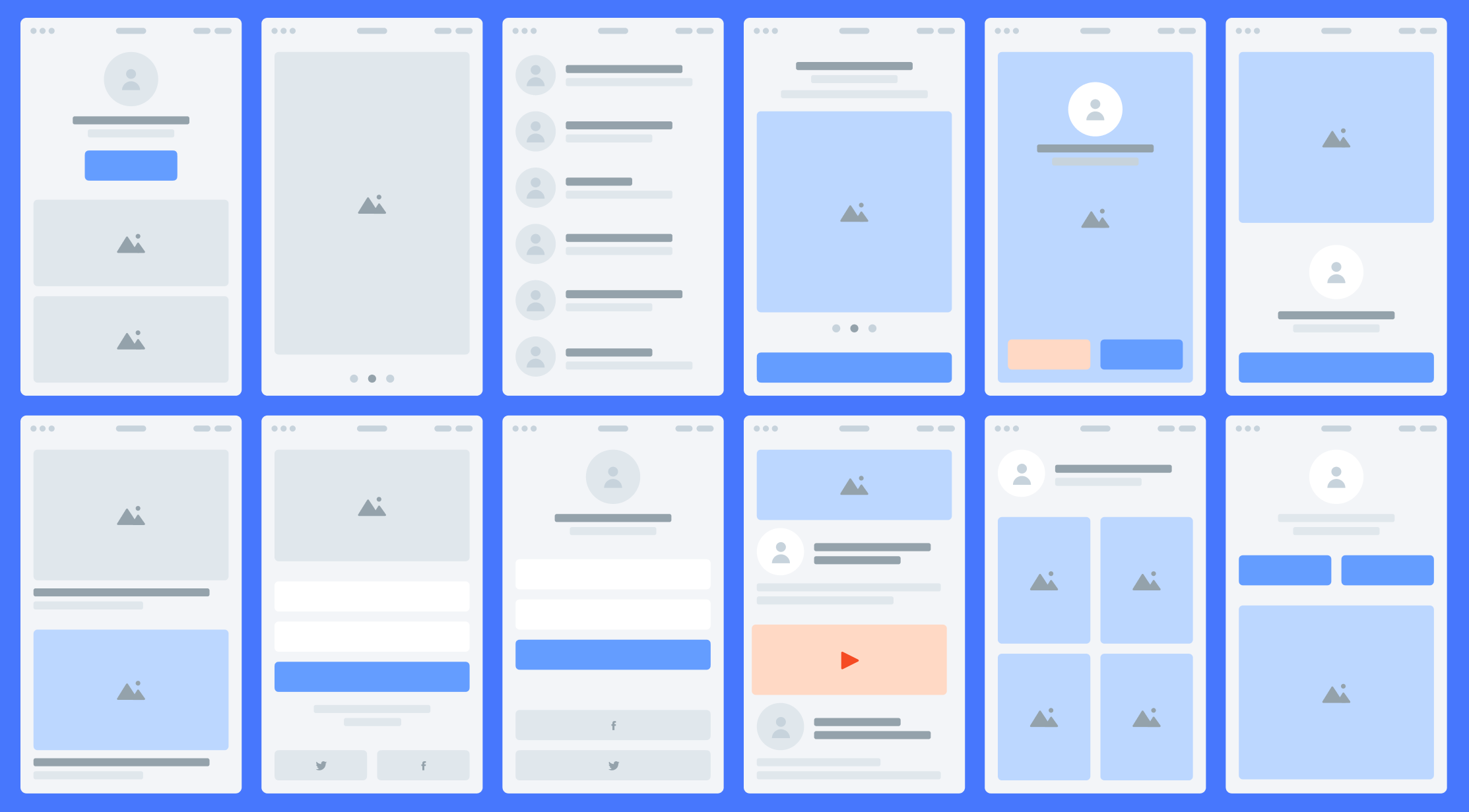
Step Six — Prototype
I've been faithful to Axure for a long time — this app had enough functionality. Hence, as not to overload prototypes with beautiful things, and at the same time make them functional: you could click on the drop-down lists, switch between pages, poke at some simple interactivity.
Clients also loved it. And it was possible to avoid the "duckling effect" when the client fell in love with the prototype at first look, and then suffered that the great layout wasn't quite similar to it. Sure, shouldn't be a 100% similarity.
Now Figma is my new love, and prototypes are drawing there. The same features with interaction, nesting, and shifts inside surfaces. Only it looks more stylish:
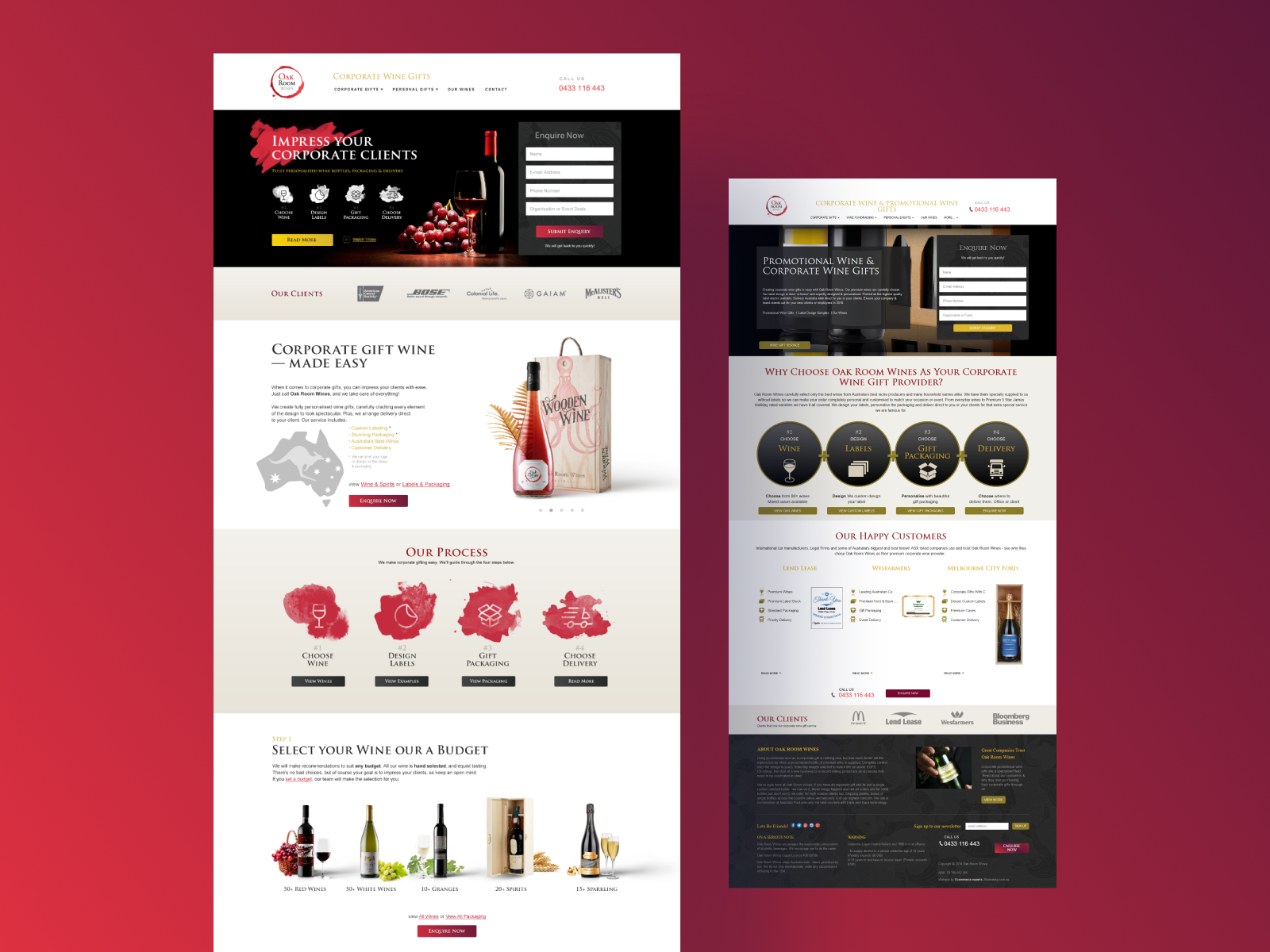
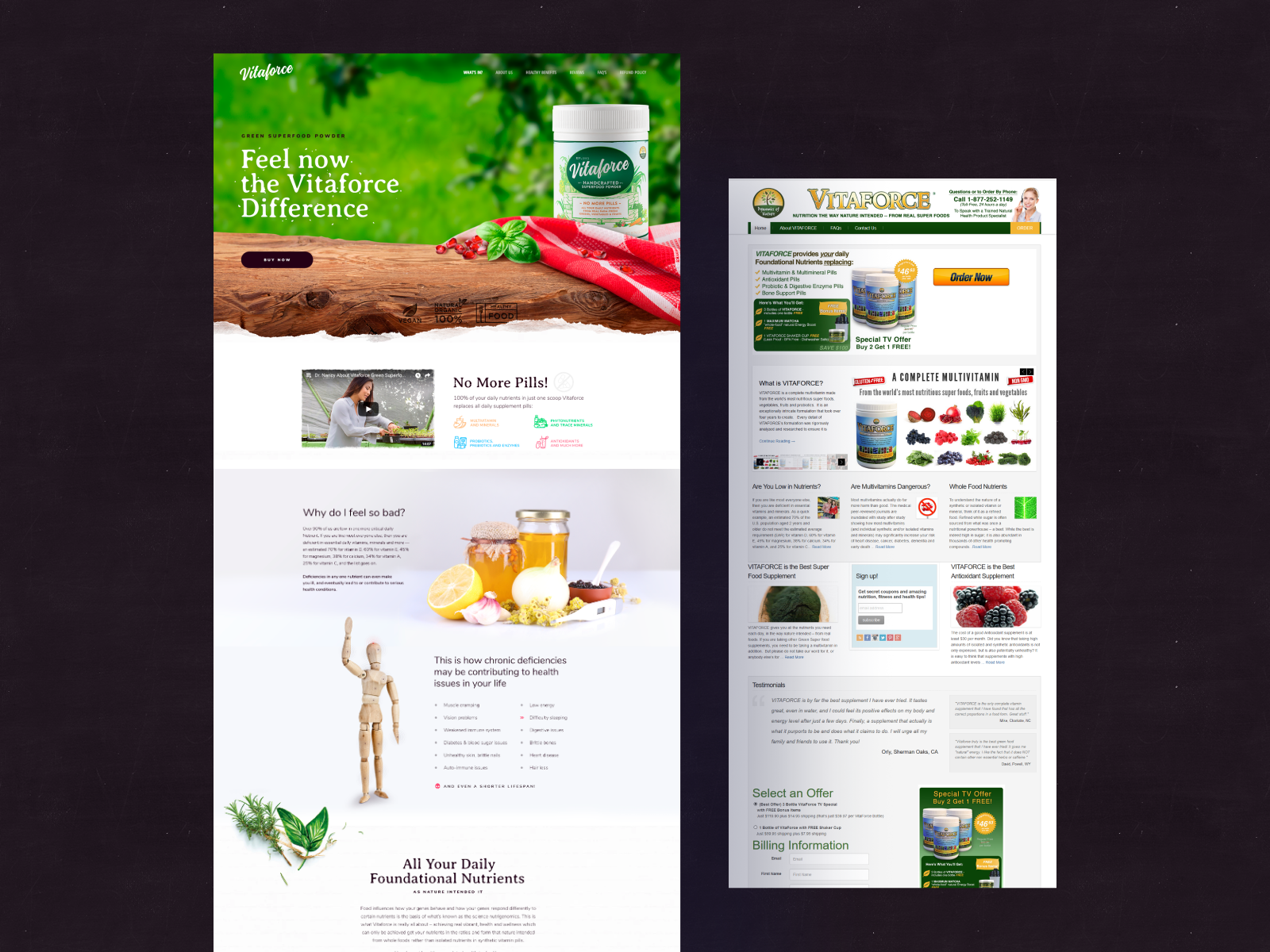
Stage Seven — Homepage Design
This stage is the actual moment of magic. The designer, putting all the collected elements (analytics, references, ideas, sketches, and prototypes) into his magic pot at the exit, receives a layout that you will fall in love with at first look
It happens for designers that somehow they are not rushing, yes. The muse does not come. But here, instead, personal laziness, carelessness, or maybe a hangover. Everything is solvable in all cases — there is a problem, there are some references, prototypes, and that's it. Breakaway from Facebook, YouTube, and keep working.
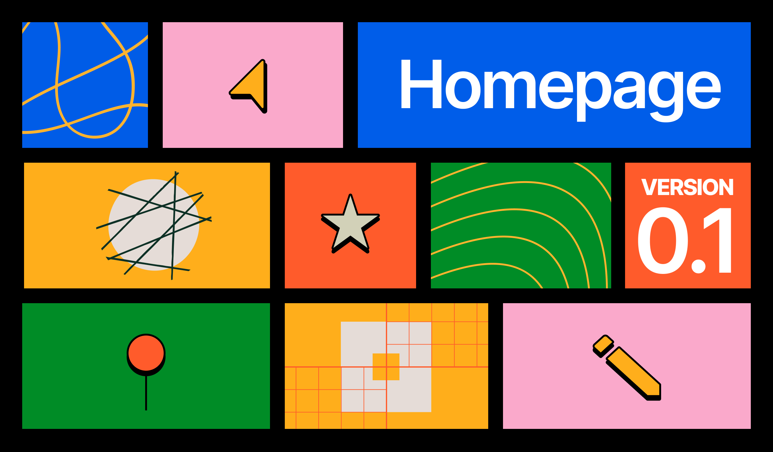
In the case of an incredibly complicated project, where the creative part is significant, there can be several brainstorms — one before creating a mood-board, the second before prototyping, and the third before start the design stage.
The Last Stage — Internal Acceptance
The factories have quality control specialists — they take examples from a fresh shipment and check them for suitability. Designers also have such an acceptance, and it's called internal. The project manager leads it. A project designer, art director, analyst, and some other managers are present.s
Internal acceptance has some objectives
- Go over the presentation of the layout for the client and prepare answers for expected questions;
- Make sure the design layout matches or exceeds of standard level;
- Receive constructive critique and improve the design, display, and presentation;
- Check-in the presentation with a fresh look for typos, mistakes, or unnecessary elements.
It happens that after internal acceptance, the layouts are significantly changing.
The Conclusion
Only eight steps and the layout is ready to appear to the client in all its brilliance. It's a separate presentation via Skype or personal — tell the background of the project, quickly go through the previous steps (aggregation, mood-board, prototype), explain the choice of fonts and colors, explain trends, and then present the primary and alternative versions.
If everything goes well with the client at the presentation, the designers will start doing the inner pages. If there are doubts, they needed to be solved and made suitable revisions. And then still start drawing the inner ones.
One way or another, after the further front and back-end programming, the designer's concept comes to life. As a result, each of you can go on the website, click and touch what not so long ago began with the analysis of persons, and turn into a real, cool product deserving of awards.