Part 1\2. Tired of Amateurs? Handpicked Signs of Bad & Top-Tier Designers

Let's Puzzle Out The Design
It would seem that the principles of decent design are as old as the world. But shitty sites with drunk fonts, ticky-tacky graphics, and illogical solutions are still plentiful on the internet. The reason is usually simple: the one who accepted this design didn't understand damn even a thing about it and trusted the specialist view. But from artist to artist — discord.
It's enough to allow this. I tried to put together an original presentation with the principles of good and not so good works and wrote this material. To make it a less number of so-so-sites from the hands of weak designers who are hiding behind the slogan, "This is how I see it."
Principles of a Good Design
Everything is in contrast —
- The background is in contrast to the content;
- Any sections of the website should contrast with others;
- Headings contrast with the main text.

Below are anti-examples. There is a problem with contrast — either the text and the background don't contrast enough, or the text on the background isn't readable:

Proximity or Padding
As a general rule, elements related in essence and structure should be located side by side. For example, the list items should stay closer to each other than the list's general heading. In the examples below
Surnames are too close to the lists
The button is too close to the text

The same padding between the text, bold text, and the button. Which element is more valuable there?

But here, the proximity from the heading to the text block is more significant than the line spacing. Also, the padding from the button to the text block is even more generous. Well, this is how it should be :)
Let your design breathe
The more free space around the elements, the better we perceive them. It is especially true for the text. Compare a couple of examples below:
If there is not enough "air" between the text blocks, the user feels uncomfortable: he is cramped, feels discomfort, and strains to find what he needs.

When the air is enough, the text reads better for the user, and he quickly finds sought info on the page.
Competent alignment
Justification — that's how typographers call it. In the printing industry, width alignment is also acceptable. But not on the web. If you use this move, for a user your text will start its Party Hard because of different screens and desktops resolutions. All the words will move away from each other at incredible distances, which is impossible to read and looks ridiculous. And we don't want to look ridiculous, do we?
There is also a center-aligned text. But you should use it only for heading or as an accent. Otherwise, you will be defeated by your own center-aligned monsters, spoiling everything around.
For a long time, we all know one proven fact. But maybe I will shock you, so get ready. Ready? Ok. Users don't read the whole text.
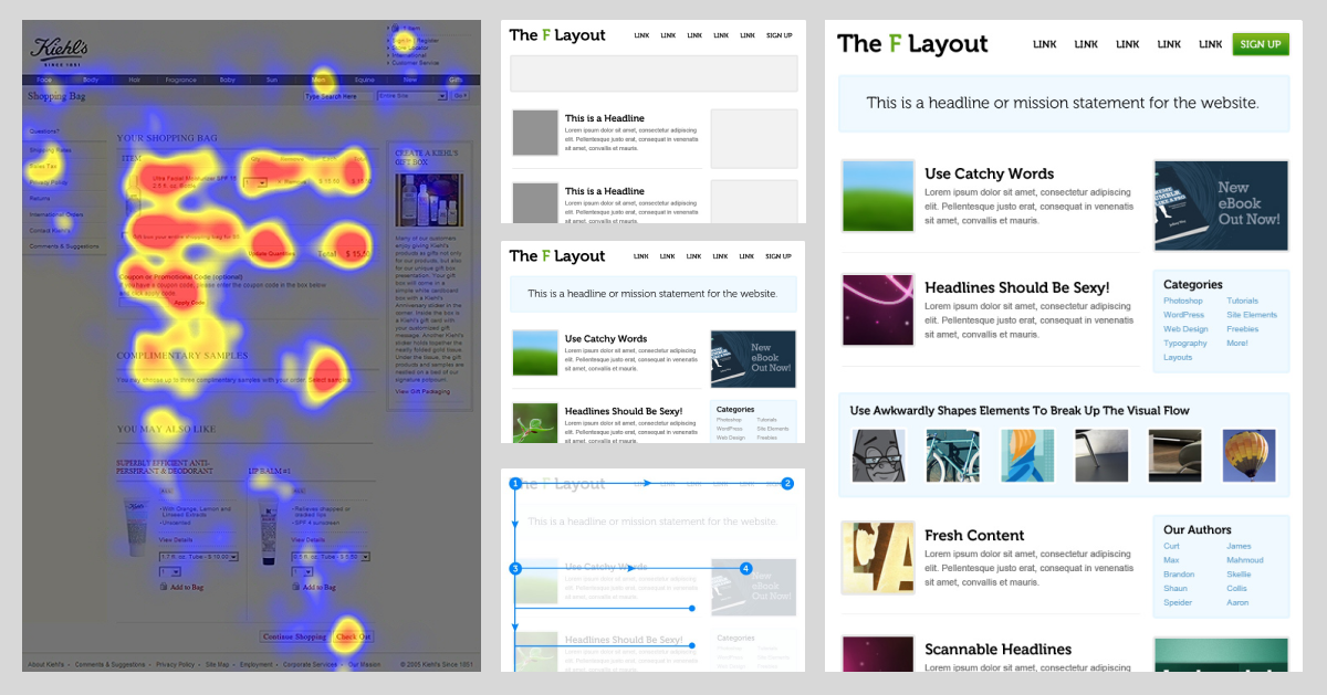
Amazing, right? Yep, we're just sliding over the page, moving according to the F-pattern. And this pattern is concentrated in the left area of the screen. That's why left alignment in web design is just a rule of good form, good manners if you like.
Continuity
The variety of beautifully designed elements all over the website: each button, each icon are unique and have their own charm! Sounds good? Nope, bad idea.
To protect yourself from this nightmare, a good designer always creates a UI kit. The Code of Laws, the Holy Scroll! Or, in other words, the guide of how to use all standard elements on all project pages — the style guide.

Typography
For website typography, applies all principles I described above: contrast, alignment, indentation (the "air"), continuity. On this project, everything is fine:

The general rule: do not use more than two typefaces. And do not use fancy fonts. Never. I mean it. Even if someone will put a gun on you.
If you still dare, this is what you'll get:
Amateur designers often have fun with font settings. All these sliders, switches...Like asking you to touch, to switch, to move. Evil switches.
Just remember: enough is enough.
Register
Caps are acceptable, but not for all text on the page. Do you like it when someone is yelling at you? Nobody likes that.
While a user reads some massive text block made with the caps, he feels like somebody is shouting at him. So let's not yell at users.
But If you want to use it only for headings or accent headings, bless you!

Tracking (intersymbol distance)
Hey, are you playing with tracking? Oh, you! Naughty, naughty! Bad designer! Stop right now!
Generally, good guys can increase the space between the capital letters a bit when they need to get the accent caption.
Leading (line spacing)
General rule. The space between text lines is equal to:
the font size +10px.
If there's less space, the text turns into mush, which is quite difficult to read — a real challenge.

Proportions
No comment needs. Oh, it hurts so much... x(

Text block width
12-column blocks are hard to read. Believe me. I guarantee you'll feel the eye-strain on the 3rd line already, right at the moment when you lose the line. Oh, and you should at least keep in mind what you are reading. So what was that line?
The width of 6-8 columns for a text block is an optimal solution.
keep reading 2nd part ›